SaaS Content Engine
SaaS landing page content checklist for feature and use-case pages
SaaS landing page content checklist for feature and use-case pages that clarifies intent, explains value, and drives the next step.
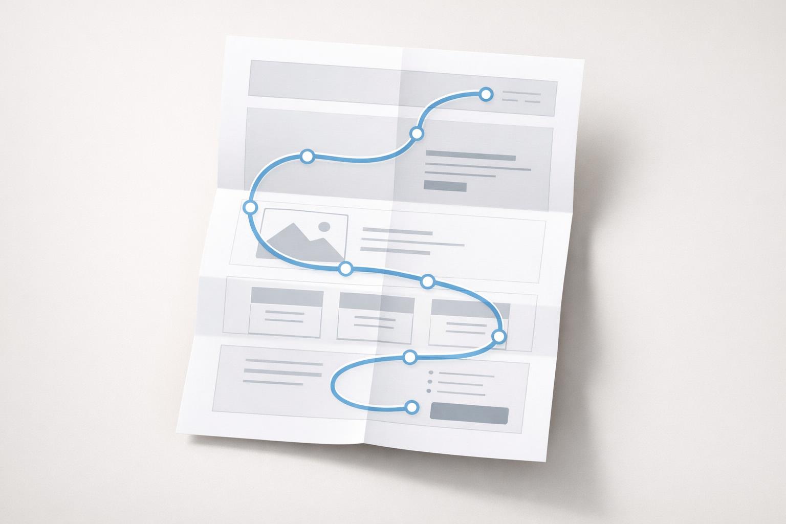
For SaaS landing page content, the page has to do more than describe features—it should answer a specific buyer’s question, show why the capability matters, and make the next step obvious.
Quick answer: A good SaaS feature or use-case page should help one specific buyer understand three things fast: what the product does, why it matters for their situation, and what to do next. The checklist is simple: align each page to one intent, write a clear headline, show the product visually, explain outcomes instead of just features, handle objections with proof, and keep one primary CTA. Feature pages should explain capability and differentiation; use-case pages should translate that capability into a specific workflow, team, or problem.
TL;DR
- Build each page around one search intent and one buyer question, not a generic “all features” pitch.
- Feature pages sell a capability; use-case pages sell relevance for a role, workflow, or pain point.
- The core page elements are: clear headline, short subhead, product visual, benefits, proof, objections, FAQs, and one main CTA.
- Keep navigation and page structure simple so visitors can evaluate quickly.
What should a feature or use-case page actually do?
Before the checklist, it helps to define the job of the page.
A feature page exists to answer, “Does your product have this capability, and is it better or easier than the alternatives?” It usually attracts people already comparing tools, evaluating requirements, or validating fit. In SaaS SEO, product and service landing pages are a distinct content type with their own search intent (SaaS SEO: The Tried & Tested Guide).
A use-case page answers a different question: “Will this product work for my exact scenario?” That scenario might be a team (“for customer success”), workflow (“for onboarding”), problem (“reduce churn”), or business model (“for agencies”). Strong use-case pages speak directly to one ICP pain point instead of trying to appeal to everyone (The 25 Biggest Traffic Losers in SaaS in 2024). That focus matters because diluted messaging makes SaaS pages harder to understand and convert.
This distinction is where many SaaS sites go wrong. They publish a feature page that reads like documentation, or a use-case page that is just the homepage with a swapped headline. Neither works well. A reader who lands on a feature page wants to see how the feature works and why it is useful. A reader who lands on a use-case page wants to see themselves in the page immediately (SaaS Content Marketing: The 9-Step Roadmap for Success).
The page does not need to say everything about your product. It needs to help the right visitor make the next decision: start free, book a demo, try the feature, or continue evaluation.
Checklist: The must-have content blocks on every page
Most high-performing SaaS landing pages follow a predictable structure because buyers evaluate software in a fairly consistent way (26 SaaS landing pages: examples, trends and best practices). You do not need every possible section, but you do need the essentials.
Here is the practical checklist:
-
One page, one goal Pick one conversion action: free trial, demo, signup, or contact sales. Pages with multiple competing goals usually get weaker.
-
Clear H1 with the outcome or capability A strong headline says what the feature does or what problem the use case solves. Keep it plain. Short headlines are common on SaaS landing pages, but clarity matters more than cleverness.
-
Short supporting subhead Add one or two sentences that explain who it is for and what changes after using it.
-
Product visual above the fold Show the interface, workflow, dashboard, or result. Not abstract stock art. Focused visuals help visitors decide faster.
-
Primary CTA placed early Put the main action near the hero and repeat it down-page. Keep the wording specific: “Start free,” “Book a demo,” or “See it in action.”
-
Three to five outcome-led benefit blocks Don’t just list “automation,” “integrations,” and “analytics.” Translate each into a business result: save time, reduce errors, launch faster, improve visibility.
-
How it works section Especially for more technical products, show the workflow in 3–4 steps. Buyers need to understand the path from setup to result.
-
Proof section Add customer logos, testimonials, short case-study snippets, usage stats, review badges, or trust indicators. Social proof lowers perceived risk (SaaS Content Marketing: The 9-Step Roadmap for Success).
-
Objection handling Address common friction directly: setup effort, security, migration, pricing fit, integrations, or team adoption.
-
FAQ section Use FAQs to resolve buying friction, not to stuff keywords.
-
Minimal distractions Keep unnecessary links, side paths, and noisy design elements limited. SaaS buyers generally do not need complex catalog-style navigation (SaaS Website Best Practices for 2026 | Lovable).
If your page is missing several of these blocks, fix the page before worrying about minor copy tweaks.
How should feature pages be written?
A feature page should not read like a release note or help article. Its purpose is to sell the importance of a capability while still being concrete.
Start with the feature name only if buyers already search for it. If not, lead with the job the feature performs. “Automated reporting for client dashboards” is often better than simply “Reporting Suite.” The reader cares less about your internal label than the outcome.
Then organize the page in this order:
- What the feature does
- Why it matters
- How it works
- What makes your approach better
- How to start using it
This is where many SaaS teams over-index on functionality. They say the feature includes filters, exports, alerts, roles, and templates. That is useful only after the reader understands the value. Put the business impact first: less manual work, faster approvals, fewer support tickets, better visibility, stronger compliance, or improved collaboration.
Show the feature in context with screenshots, annotated UI, or a short workflow diagram. For skeptical buyers, the best proof is often “show me the actual product.” This is especially important when your category is crowded and the feature sounds similar to competitors.
A strong feature page also includes differentiation. Not hype—specifics. Maybe your reporting updates in real time, your setup takes minutes, your audit trail is built in, or your output publishes directly to a CMS. Those are differentiators if they are true and materially useful.
Finally, link feature pages to related use cases, comparisons, pricing, and docs. Feature pages often sit in the middle of evaluation, so they should help the buyer continue naturally instead of dead-ending after the CTA.
How should use-case pages be written?
Use-case pages are where relevance wins. The best ones make the target reader feel, “This is for my exact situation.”
That starts with narrowing the audience. Do not write one page for “marketing teams, agencies, startups, and enterprises.” Pick one. Use-case pages perform best when they target one person, one workflow, or one problem.
A useful formula is:
For specific audience, solve specific problem with specific product capability, resulting in specific outcome.
For example: - For customer success teams, reduce churn with automated health-score alerts - For agencies, publish client SEO content at scale without manual handoffs - For IT teams, simplify access control across distributed teams
The page should then mirror how that audience thinks:
- What is going wrong now?
- What does that cost in time, revenue, risk, or effort?
- How does your product fit their workflow?
- What result can they expect?
- What proof do you have from similar customers?
A common mistake is simply reusing feature copy and swapping in a new audience label. That produces generic pages that rank poorly and convert poorly. A real use-case page should mention the team’s workflow, metrics, constraints, and objections. Agencies care about client throughput and reporting. Founders care about speed and budget. Ops teams care about reliability and process control .
This is also the best place for mini case studies. One short example with a believable before/after is stronger than five vague testimonials. If you lack customer stories, use scenario-based examples, but label them honestly as examples rather than results claims.
Use-case pages are especially effective for long-tail SEO because they map to very specific intent clusters, which can be easier to rank for than broad category terms. Just be careful not to mass-produce thin pages with only superficial variations; programmatic SaaS pages can lose traffic when they are low-value or overly repetitive.
What should you remove, simplify, or test?
A checklist is not only about what to add. High-converting landing pages are often better because they remove friction.
First, remove broad, empty claims. Phrases like “powerful platform,” “all-in-one solution,” and “seamless experience” do almost no work unless immediately supported by specifics. If a sentence could fit any SaaS company, it is probably weak.
Second, simplify your CTAs. Two CTAs can work when they match distinct intent levels, but most pages benefit from one primary action and one lighter secondary path at most. Too many choices create hesitation.
Third, keep navigation lean. A landing page should not force people into a maze. SaaS sites generally perform better when navigation emphasizes feature pages, use-case pages, and pricing rather than sprawling menu systems.
Fourth, watch page speed. Slow landing pages can lose visitors before your copy has a chance to work. Google research cited by industry sources ties slower Largest Contentful Paint to materially higher bounce probability. Heavy hero images are a common culprit.
Fifth, test the parts that actually change decisions: - Headline - Subhead - Hero screenshot - CTA text - Proof placement - Objection-handling section - Demo form length
One more point: SaaS landing page conversion rates are often mediocre, which means there is usually room to improve the page itself before blaming traffic quality. Multiple industry sources cite median SaaS landing page conversion around 3.8%, below broader landing page benchmarks. Treat that as directional, not as your target. A page with strong message-match can outperform category averages substantially.
A working content checklist you can use page by page
If you want a practical review tool, use this before publishing any feature or use-case page.
Positioning - Is the page built for one intent? - Is it clear whether this is a feature page or a use-case page? - Does the page target one audience, problem, or capability?
Hero section - Does the H1 clearly state the capability or outcome? - Does the subhead explain who it is for? - Is there a real product visual? - Is the primary CTA obvious?
Body copy - Are benefits written as outcomes, not just functions? - Does the page explain how it works in simple steps? - Are there specifics instead of generic claims? - Is there a section that compares your approach implicitly or explicitly to alternatives?
Trust and conversion - Is there proof near the top half of the page? - Are major objections answered? - Is the CTA repeated naturally? - Does the page end with a clear next step?
SEO and discoverability - Does the title target the actual query? - Are headings aligned to buyer questions? - Is the FAQ useful and non-repetitive? - Does the page link to related features, use cases, pricing, and supporting content?
Quality control - Would this still make sense to someone new to your product category? - Is any section obviously copied from another page with only minor wording changes? - Does the page earn its existence, or should it be merged with another URL?
That last question matters. More pages are not automatically better. The best page set covers distinct intents cleanly, without cannibalizing itself or creating thin content.
Bottom line
If your SaaS landing pages are not converting or ranking, the problem is often not volume of content but lack of page specificity. Feature pages should prove a capability. Use-case pages should prove fit for a specific situation. When each page has one intent, one message, real product evidence, solid proof, and one clear CTA, both SEO and conversion get easier.
If you are building these at scale, the hard part is consistency: researching intent, writing useful page variants, checking facts, and publishing without creating thin duplicates. That is exactly the kind of workflow worth automating. Get started today.
If you are building SaaS landing page content at scale, the hard part is keeping each page specific, evidence-backed, and clearly different enough to earn its place.